
Every year, thousands of medication errors happen because two drug names look or sound almost identical. Tall-man lettering is one of the simplest, cheapest, and most widely used tools to stop these mistakes before they hurt someone. It doesn’t require new machines, extra staff, or expensive software. All it takes is changing how drug names are typed - capitalizing the key letters that make them different.
What Is Tall-Man Lettering?
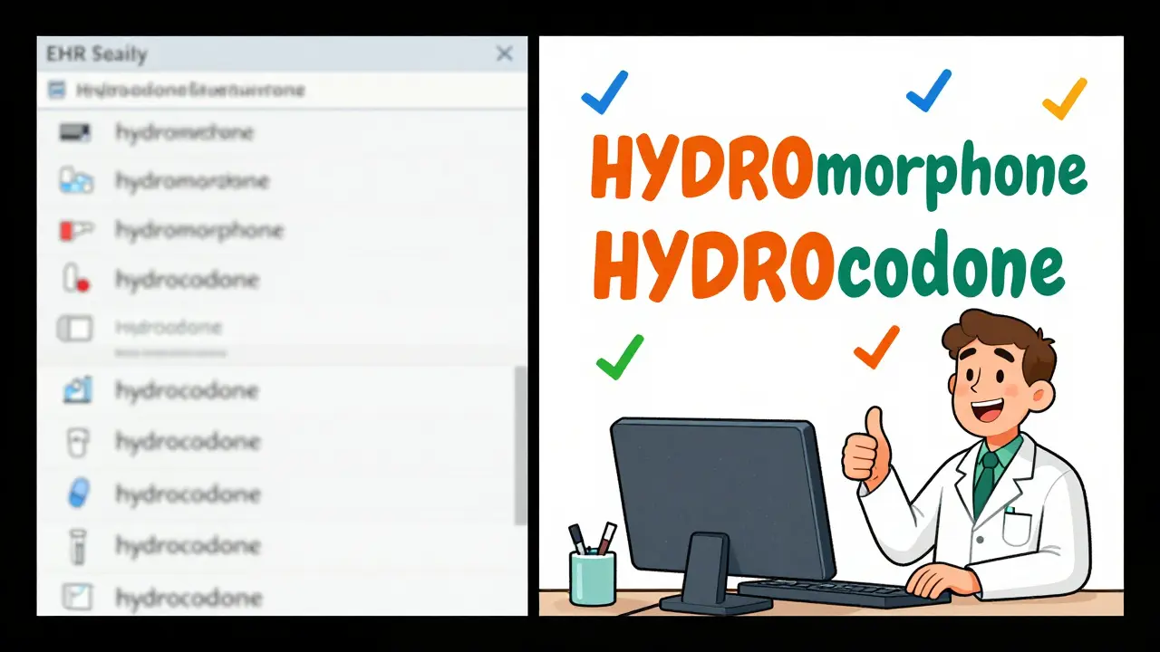
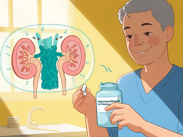
Tall-man lettering is a visual trick that uses uppercase letters to highlight the parts of drug names that differ. For example, instead of writing "prednisone" and "prednisolone," you write "predniSONE" and "predniSOLONE." The capitalized "SONE" and "SOLONE" jump out to the eye, making it harder to grab the wrong one.
This isn’t just a design choice. It’s a safety standard backed by decades of research. The Institute for Safe Medication Practices (ISMP) first introduced the idea in 1999. Since then, the U.S. FDA, Australia’s Health Commission, and dozens of hospitals worldwide have adopted it. The goal? Cut down on look-alike, sound-alike (LASA) errors - the kind that happen when a nurse grabs alprazolam instead of lorazepam, or when a pharmacist fills a prescription for hydrocodone thinking it’s hydromorphone.
These aren’t rare mistakes. One in every 1,000 prescriptions filled in hospitals leads to a medication error because of confusing names. Some of those errors cause serious harm. Tall-man lettering doesn’t fix every problem, but it’s one of the few tools that works fast, works for everyone, and costs almost nothing to implement.
How It Works: The Science Behind the Letters
The human brain reads words as whole shapes, not individual letters. When two drug names are almost the same - like "cisplatin" and "carboplatin" - your eyes skim past them quickly. In a busy pharmacy or emergency room, you don’t have time to read every letter. That’s where tall-man lettering helps.
By capitalizing the unique parts - "CISplatin" and "CARBOplatin" - you break the visual pattern. Your brain notices the difference before you even realize you’re looking. A 2004 eye-tracking study by ISMP showed that healthcare workers made 35% fewer selection errors when drug names used tall-man lettering compared to standard lowercase text.
It’s not about making the whole word bold or italic. It’s about precision. The capital letters must be placed where the names diverge. For "vinblastine" and "vincristine," you write "vinBLAStine" and "vinCRIStine." The "BLAS" and "CRIS" are the critical differences. Capitalizing "vin" or "tine" wouldn’t help - those parts are the same.
The trick works best when the capitalization is consistent. If one system writes "HYDROmorphone" and another writes "Hydromorphone," confusion grows instead of shrinking. That’s why standards matter.
Who Sets the Rules? FDA, ISMP, and Australia’s List
There’s no single global rulebook for tall-man lettering. Three major groups maintain lists:
- U.S. Food and Drug Administration (FDA): Maintains a list of 72 drug pairs that should use tall-man lettering. Their guidance is focused on drugs with the highest risk of mix-ups.
- Institute for Safe Medication Practices (ISMP): Has a much larger list - 252 drug pairs - updated every quarter. Their list includes more brand names and less common drugs.
- Australian Commission on Safety and Quality in Health Care: Uses a list of 192 drug pairs, called the National Mixed-Case Lettering List. Their version is updated annually and aligns closely with ISMP but includes local drug names used in Australia.
These lists aren’t just suggestions. They’re used by hospitals, pharmacies, and EHR vendors to build safety into their systems. In Australia, tall-man lettering is mandatory in all public hospitals. In the U.S., The Joint Commission requires it as part of National Patient Safety Goal NPSG.01.01.01.
But here’s the problem: the lists don’t always match. The FDA says "HYDROmorphone" and "morphINE," while ISMP recommends "HYDROcodone" and "oxyCODONE." If your hospital uses one standard and your pharmacy uses another, you’ve created a new kind of confusion. That’s why harmonization efforts began in 2023 - a joint FDA-ISMP project to align the lists by mid-2024.
Where Tall-Man Lettering Is Used
It’s not enough to change the name on a label. Tall-man lettering has to appear everywhere a drug name shows up:
- Electronic Health Records (EHRs) - like Epic, Cerner, Meditech
- Computerized Provider Order Entry (CPOE) systems
- Automated dispensing cabinets (like Pyxis machines)
- Prescription labels printed at the pharmacy
- Drug product packaging (vials, blister packs)
- Medication administration records (MARs)
A 2022 study in *Pharmacology Research & Perspectives* tracked a hospital that changed 210 drug names across 13 different systems. It took 16 weeks to complete, but after implementation, the number of overridden safety alerts dropped by 42% in six months. That’s not just a number - it’s 42 fewer chances for someone to get the wrong drug.
But if one system uses tall-man lettering and another doesn’t, the benefit disappears. A 2023 survey by Wolters Kluwer found that 63% of pharmacists said their organization’s systems didn’t match. One pharmacist in Melbourne reported her hospital used "PARoxetine" in the EHR, but the automated dispenser showed "FLUoxetine" - both wrong. The community pharmacy used yet another version. No wonder mistakes still happen.
When It Works - And When It Doesn’t
Tall-man lettering is powerful, but it’s not magic. It works best when:
- The difference between names is in the middle or end of the word (e.g., "predniSONE" vs. "predniSOLONE")
- The font is clear and readable
- Everyone uses the same standard
- It’s combined with other safety steps (like barcode scanning or double-checks)
It struggles when:
- The difference is at the start - "metoprolol" and "methyldopa" both start with "met," so capitalizing the end doesn’t help
- Fonts are too small - in some EHRs, the capitalized letters are hard to see on a tiny screen
- People get used to it and stop paying attention
- It’s the only safety layer - no barcode, no double-check, no training
One 2016 study in *Pediatrics* claimed tall-man lettering didn’t reduce errors. But that study had a big flaw: it didn’t check if hospitals were actually using it correctly. If you say you’re using tall-man lettering but your system still shows "LORazepam" and "ALPRAZolam" in all lowercase, no amount of theory will help.
Real-world success comes from consistency. Nurse practitioners in Australia report that "predniSONE" now triggers an automatic mental pause. "I don’t even have to think about it anymore," said one in the *American Journal of Nursing*. "I just see the S-O-N-E and know it’s not the one I’m looking for."
How to Implement It Right
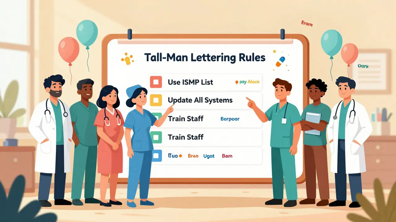
If you’re setting this up in your hospital or pharmacy, here’s how to do it right:
- Form a team - Include pharmacists, nurses, IT staff, and a medication safety officer. Don’t let IT do it alone.
- Choose your standard - Pick either ISMP or FDA (or Australia’s list if you’re in Australia). Stick to it. Don’t mix sources.
- Map your systems - List every place drug names appear: EHR, dispensing cabinets, printers, mobile apps.
- Update the systems - Work with your EHR vendor. Make sure the changes apply to all screens, reports, and printouts.
- Train everyone - Don’t assume staff know why the letters are capitalized. Show them examples. Explain the difference between "CISplatin" and "CARBOplatin."
- Monitor and adjust - Track how many LASA alerts are being overridden. Survey staff. If people say "I still can’t tell them apart," fix the font size or capitalization.
Implementation takes time. For a 500-bed hospital, expect 16 weeks from start to finish. Budget for IT support - 68% of hospitals report legacy system issues. And don’t forget: this isn’t a one-time fix. New drugs are approved every year. Your list needs regular updates.
What Experts Really Think
Not everyone is sold on tall-man lettering. Dr. Robert Wachter, a patient safety expert, calls it a "false sense of security." He argues that forcing functions - like making the system block you from selecting a similar drug unless you confirm - are more effective.
But Dr. Michael Cohen of ISMP says it’s not about choosing one tool over another. "It’s about layers," he told *Pharmacy Times* in 2022. "Tall-man lettering is one layer. Barcode scanning is another. Double-checks are another. You need all of them."
The Cochrane Collaboration reviewed 20 studies and rated the evidence for tall-man lettering as "moderate certainty" for reducing selection errors - but "low certainty" for reducing actual patient harm. That’s because harm is rare, and many errors are caught before they reach the patient.
Still, the cost-benefit is clear. In Australia, implementing tall-man lettering across a hospital system costs about AU$1,200. That’s less than a single expensive drug error. And adoption is growing: 89% of U.S. hospitals use it, 76% in Australia, and nearly all hospitals over 200 beds.
The Future of Tall-Man Lettering
Will AI replace it? Maybe someday. Epic Systems is testing an AI system that adjusts tall-man lettering based on real-time error data. Early results show a 29% better reduction in mistakes than static lists.
But even as voice recognition and automated dispensing become more common, ISMP says tall-man lettering will stay. Why? Because humans still read, still click, still make split-second decisions. And when you’re tired, stressed, or rushed - the visual cue still works.
The goal isn’t perfection. It’s prevention. One less wrong drug given. One less patient harmed. One less apology to make.
Tall-man lettering doesn’t fix everything. But it fixes something real. And in healthcare, that’s enough.
What is tall-man lettering in pharmacy?
Tall-man lettering is a method of writing drug names with selective capitalization to highlight differences between look-alike, sound-alike (LASA) medications. For example, "predniSONE" and "predniSOLONE" make it easier to tell apart prednisone and prednisolone, reducing the risk of medication errors.
Which organizations recommend tall-man lettering?
The U.S. Food and Drug Administration (FDA), the Institute for Safe Medication Practices (ISMP), and Australia’s National Commission on Safety and Quality in Health Care all recommend tall-man lettering. Each maintains its own list of drug pairs that should use this formatting, with ISMP’s list being the most comprehensive.
Does tall-man lettering actually reduce medication errors?
Yes - when implemented correctly and consistently. Studies show up to a 35% reduction in selection errors during simulated prescribing. Real-world data from hospitals show a 40-50% drop in overridden safety alerts after implementation. However, it only works if all systems use the same format and staff understand why it’s used.
Why do some hospitals still mix up drug names even with tall-man lettering?
The main reason is inconsistent application. If one system writes "HYDROmorphone" and another writes "Hydromorphone," or if the font is too small to see the capital letters, the visual cue fails. Some systems don’t support tall-man lettering at all. Without standardization across all platforms, confusion grows instead of shrinking.
Is tall-man lettering required by law?
In the U.S., The Joint Commission requires hospitals to use approved methods to differentiate look-alike drug names, which includes tall-man lettering. In Australia, it’s mandated in public hospitals. While not a federal law, it’s a mandatory safety standard for accreditation and licensing in most healthcare systems.


15 Comments
man i just saw a nurse grab predniSONE instead of predniSOLONE yesterday and i was like... damn, this actually works. no idea why more places dont use it. costs nothing, saves lives.
oh wow. another ‘low-tech solution’ that somehow requires 16 weeks of IT meetings and a committee. next they’ll tell us to wear socks to prevent slips. revolutionary.
This is one of those rare interventions where the science is clear, the cost is negligible, and the impact is profound. The fact that implementation remains inconsistent speaks less to the tool and more to systemic inertia in healthcare. A small change with outsized returns-exactly the kind of win we need more of.
Of course it works-because it’s the only thing that doesn’t require doctors to actually think. Let’s just make the letters BIGGER so our brains don’t have to. Genius. Next up: putting a neon sign on the word ‘NOT’ in ‘NOT for IV’.
Let’s be real-this is a band-aid on a hemorrhage. If your EHR vendor can’t normalize drug name fields across systems, you’ve got deeper architectural failures. Tall-man lettering is a compliance checkbox, not a safety system. And don’t get me started on the 63% mismatch rate-this is why we still have preventable deaths.
Just wanted to say-this is the kind of thing that makes me proud to be in healthcare. Small, smart, human-centered fixes like this? That’s the stuff that matters. Keep pushing for consistency. We’re all in this together.
Wait... so we’re still doing this? We’re still capitalizing letters like it’s 2004? And nobody’s thinking about AI-driven contextual disambiguation? This is like using a flip phone because ‘it’s reliable.’ We’re literally leaving lives on the table because we’re too lazy to upgrade.
Love this! In India, we don’t have this yet-but I showed our pharmacy team and they’re starting a pilot. We’ve had two near-misses with ‘chloroquine’ and ‘chlorpromazine’. This is simple, free, and smart. Let’s spread it globally. No need to overcomplicate.
It is imperative to underscore the fact that tall-man lettering constitutes a non-trivial component of the broader pharmacovigilance architecture. Its efficacy is contingent upon uniform adherence to standardized orthographic protocols across heterogeneous clinical information systems. Failure to synchronize implementation paradigms engenders counterproductive cognitive dissonance among end-users.
Let’s not kid ourselves-this is just a distraction. The real problem is understaffed pharmacies and overworked nurses. Capitalizing letters won’t fix a 12-hour shift with zero breaks. We’re treating symptoms while the patient bleeds out.
Did you know the FDA’s list was influenced by Big Pharma lobbying? They only include drugs that don’t have generic competitors yet. The real dangerous pairs? They’re left off the list. This is all a smokescreen. You think they want you to catch errors? Nah. They want you to think they care.
USA best. We got this figured out. Other countries? They still write everything lowercase. No wonder they have problems. We’re not just smart-we’re disciplined. Capital letters = American safety. #MakeHealthcareGreatAgain
Every time I see ‘predniSONE’ I think about how fragile human life is. One misplaced capital letter and someone’s kid doesn’t come home. It’s not just a formatting choice-it’s a moral stance. We choose to see. We choose to care. Or we don’t. And that’s the real tragedy.
Works when done right. Consistency is everything.
Everyone’s acting like this is some breakthrough. In 2010, we had a hospital in Delhi that used color-coded labels instead. Zero errors for three years. Tall-man lettering is just the lazy Western version of the same idea. We’re celebrating a Band-Aid because we refuse to fix the wound.